No, New York Has Not Flattened The Curve
I keep reading – and hearing – that New York has successfully “flattened the curve,” and it makes me wonder if people have just decided to go into hibernation the past three months. It’s not outside the realm of possibility; we all have lots of free time on our hands now. However, it’s a sign that our political discourse has become so warped that our politicians can say things that are patently false with very little pushback.
What did I expect? As a politician, he’s not going to say, “New York has been decimated by the virus,” but that’s precisely what happened. I haven’t talked about “flatten the curve” at all on this blog because it assumed that it was well understood by most. I was obviously wrong. How else can a governor of one of the largest states get away from saying, “we crushed” the curve?
What Does “Flatten The Curve” Even Mean?
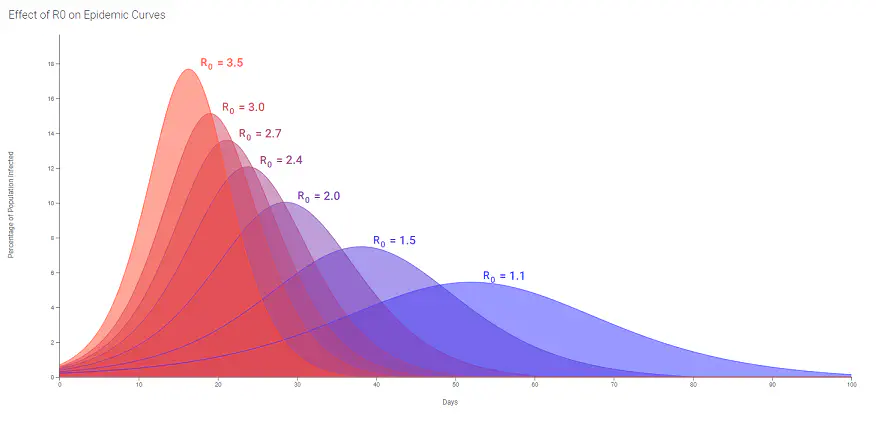
Flatten The Curve is an objective, which refers to the “what if” epidemiological curve. What it means is that instead of the rate of rising being very rapid, perhaps a doubling in cases every 4 - 7 days, we cut the doubling to every 2 - 3 weeks. The purpose of flattening the curve was to prevent an overwhelming of the health care system, so health care professionals can find more effective ways of treating infected patients.
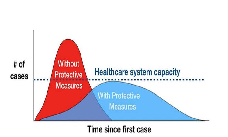
The following image shows what a flattened curve should obviously look like. The red-shaded steap curve shows a scenario with preventative measures (social distancing, mask, etc.), while blue-shaded curve shows a scenario with protective measures. The blue-shaded curve is flatter than the red-shaded curve, and that is the scenario that we are trying to implement.
Notice how I didn’t say any of this would happen, because there is no guarantee that that it should. There are other factors that we may fail to consider and you’ll know you’re at the peak until you’ve reached it.
So, what happened? Did we get the blue-shaded flat curve?
About a month or so ago, I did a project on tracking COVID-19 cases globally; part of that analysis involved looking at different U.S. States [1]. Around that time, cases in New York were doubling every 7 days.
Today New York, the increase in cases is relatively stable, trending at ~1,200 additional cases a day. However, during the early days of the pandemic, the New York average around 10,000-12,000 additional cases day. The state was probably responsible for at least 30 percent of all new coronavirus infections.
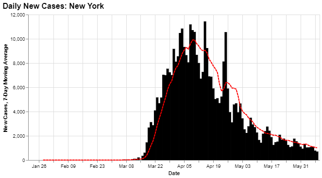
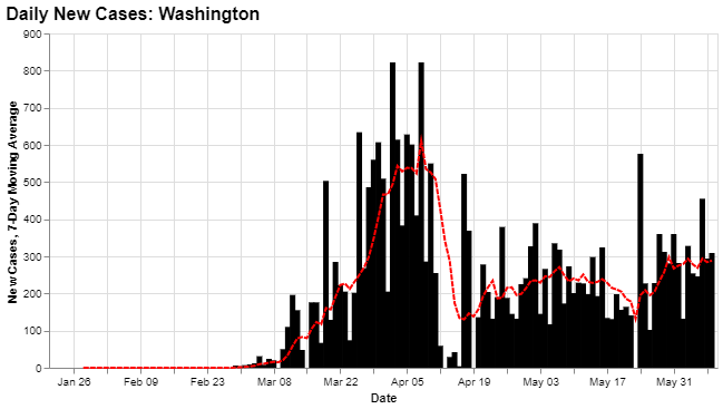
So, to answer a previously-posed question, no, we did not get the blue-shaded flat curve, synonymous with a gradual increase in new infections. Instead, what we witness was a rapid spike in daily cases. At least, when compared to cases in Washington State, which did experience a large surge in cases but managed to taper off early during the crisis.
But that is all in the past. New York is doing relatively better now, even as cases surge in places that were previously managing the virus well. So, what exactly is New York doing that is so special? It’s not as if New York is doing anything spectacular when it comes to testing or tracing.
The main thing that happened… was the virus rushed through the most susceptible people in the population.
In my post, The Mathematics of Pandemics, I laid out the framework as to why you can prove (mathematically) that the virus always dies out [2]. (susceptible people get exposed; exposure becomes an infection; infectives either recover or die) It doesn’t happen when the disease infects everyone in the population, or when the pathogen mutates into something else.
The simple reality is that contact between the remaining infectives and susceptibles become so infrequent that the infectives never get a chance to pass on the disease before being removed from the equation (recovering with immunity or dying). The virus dies due to the lack of infectives, not the lack of susceptibles.
For the most part, this has happened (is happening) in New York. Several factors can increase the risk of the susceptibility of COVID-19; however, we know that the disease is more susceptible to individuals over the age of +65-years-old. We can see from the data, the death rate for people age 65 and over is more than ten times higher than for people under 65-years-old [3].
So if your objective is to flatten the curve starting March, you would expect to see a steady increase in the number of infections, spread out over months. If you failed to flatten the curve, you saw a huge spike in cases, followed by a massive spike of fatalities, followed by a rapid decrease, as we saw here in New York.
Putting this in perspective, if the State of New York were a country, it would have the highest death rate in the world. That’s not a novelty.
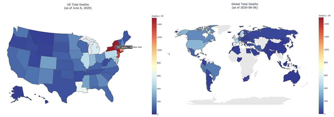
We are noticing a surge in cases in other parts of the country, places that have yet to experience their first wave (Flordia and Arizona). Deaths in these states are relatively small. The death rate from COVID-19 is ~170 per 100,000 people in New York State [4], Arizona has reported ~1,000 COVID deaths. For Arizona to have a death rate comparable to New York, there would need to be +11,200 additional deaths from COVID in Arizona, which doesn’t seem likely. (Florida would need to have +35,000 new deaths)
As the state begins its Phase One plan for reopening the economy, it is unlikely to result in a huge surge in cases. However, cases will eventually start rising again. Once it does, will New Yorkers tolerate another lockdown?
Sources
[1] Kid Quant | Tracking COVID-19 Cases Globally
[2] Kid Quant | The Mathematics of Pandemic
[3] Statista | Death rate for COVID-19 in New York City by age
[4] Statista | Death rates from coronavirus (COVID-19) in the U.S.
Andre Sealy
Quant Research / Data Scientist / Writer
My research interests involves Quantitative Finance, Mathematics, Data Science and Machine Learning.