Tracking COVID-19 Cases Globally
Unless you’ve been living under a rock, you’ve probably heard of an illness called Severe Acute Respiratory Syndrome Coronavirus 2 (SARS-CoV-2), the disease that causes the Coronavirus Disease 2019 (COVID-2019). The disease is considered the most infectious and deadly illness since the Spanish Flu in 1919. In response, schools have closed; Public areas have shut down because; economies have come to a grinding halt because of it, and we’re all paranoid about being around other people.
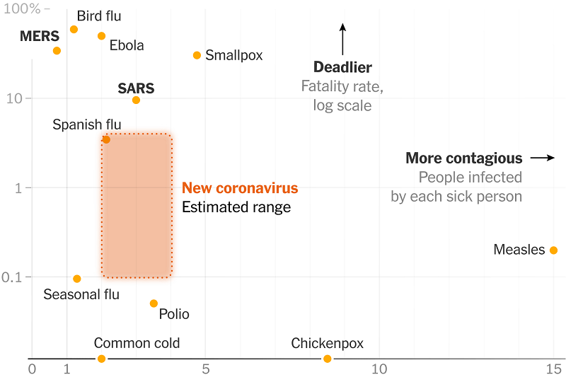
Most of us have never lived through a Pandemic (unless you count the 2009 H1N1 Pandemic), so we will have no idea how bad this could possible get. Scientist have attempted to determine how deadly this dieases is compared to others throughout history, as seen in the following chart.
Right now, it’s assumed that this virus is just as contagious as other diseases such Polio and the Common Cold while being more deadly than these other diseases. As such, the scientific community has devoted all of their resources in finding ways to track the growth of this dieases.
The purpose of this notebook is to determine the rate at which confirmed cases of COVID-19 are growing in many places around the world.
The data I will be using for this project comes from John Hopkins University, which has developed a COVID-19 map, which tracks the number of COVID-19 cases, hospitalization, and deaths around the world.
John Hopkins also provides a Data Repository of global COVID-19 cases.
Some Basic Ideas
There are a couple of mathematical techniques known as compartmental models that are used to model infectious diseases. In these models, epidemiologist divides the population into separate groups, with the assumption that individuals in the same compartments share the same characteristics.
We are still in the early stages of COVID-19, and we are still learning more about the virus every day. To accurately forecast the growth of COVID-19, the underlying dynamics of transmission need to be determined.
The driving factors COVID-19 (as well as any other dieases) includes the following factors:
- The number of people on average becomes infected. This is known as the “reproduction rate,” or $R_{0}$. Basically, if one person becomes infected, how many people will this person infect on average by coming into contact with other people? The World Health Organization is has estimated that this rate is around 1.4 - 2.5 people in the past.
- The amount of time it takes for the virus to double is measured by the growth cumulative confirmed cases, which is different from the frowth of infections. The doubling as time passes is a trend known as Exponential Growth.
- The doubling time calculated here measures the growth of cumulative confirmed cases, which is different from the growth of infections. For example, if a country suddenly ramps up testing, then the number of confirmed cases will rapidly rise. Still, infections may not be growing at the same rate.
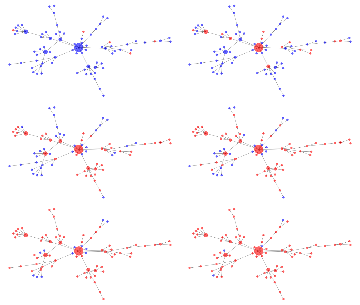
The following graph shows how an epidemic might spread across a network over time. Blue dots are susceptible individuals, while red dots are infected people. Two dots are connected by a line if they are in contact with each other, and the more connections a person has, the bigger their dot is on the network.
Exponential growth models start with a small number of infected individuals in a large population, such as when the virus first emerged in Wuhan, China. However, it’s not a good model once a large number of people have been infected. This is because the chance of an infected person contacting a susceptible person declines, simply because there are fewer susceptible people around, and a growing fraction of people have recovered and developed some level of immunity.
Eventually, the chances of an infected person contacting a susceptible person becomes low enough that the rate of infection decreases, leading to fewer cases and eventually, the end of the viral spread.
Looking at the Data
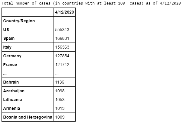
First, we’re going to aggregate the daily Coronavirus cases by each country, rather than the Province or State. We’re going to sort these values in ascending order and filter our nations with more than 1,000 cases thus far. This gives us roughly 70 countries to work with.
As we can see, the U.S. has the highest number of COVID causes in the world. The nation crossed that milestone sometime last week. Right behind the U.S. is Spain, Italy, Germany, and France. As mentioned previously, as nations conduct more testing, we can confirm more cases.
Next we will be fitting the graph on a Logistic Curve, which is commonly used to represent growth processes.
$$f(x)=\frac{a_{0}-a_{1}}{1+(x/a_{2})^{a_{3}}}+a_{1}$$
The logistic curve has determined by the 4 parameters:
- Initial Value: The value of the curve as $x$ goes to zero.
- Final Value: The value of the curve as $x$ foes to infinity.
- Center: The halfway point in the transition from Initial Value to Final Value.
- Hill Slope: The Hill slope of the curve.
We will also create a python function for the exponential function. Both will be utilizes for determining the trend.
def logistic(t, a, b, c, d):
    return c + (d - c)/(1 + a * np.exp(- b * t))

def exponential(t, a, b, c):
    return a * np.exp(b * t) + c
Finally, we’re going to create a function that allows us to plot historical case for each country, which will vary throughout time. This will involve create a time series array for each individual country.
For each country, we record the most recent cases from this week, as well as the number of cases from the same time period one week ago. We will use this information to calculate a ratio, which will serve as the one-day growth rate, weekly growth rate, and the growth factor for the exponential function. The growth factor is what’s used to measure the amount of time it takes cases to double (which is currently every 3 days for most of the Western world).
The code will attempt to create an exponential curve fit and a logistic curve fit, based on the trend the nation is experiencing. We estimate the fit by simply calculating the the sum of total residuals relative to the total sum of squares.
$$R^{2}=1-\frac{SS_{RES}}{SS_{TOT}}=1-\frac{\sum_{1}(y_{i}-\hat{y}{i})^{2}}{\sum{1}(y_{i}-\bar{y}_{i})^{2}}$$
Once the code has modeled both functions, it will determine if a logistic or exponential curve fits better (the program may also use both if it is unable to determine which curve fits better). Based on that calculation, the program will return the Weekly increase, Daily increase, and the doubling time, as well as the $R^{2}$ and the amount of time it takes for cases to double. After these calculations are done, the code will return a plot for each country.
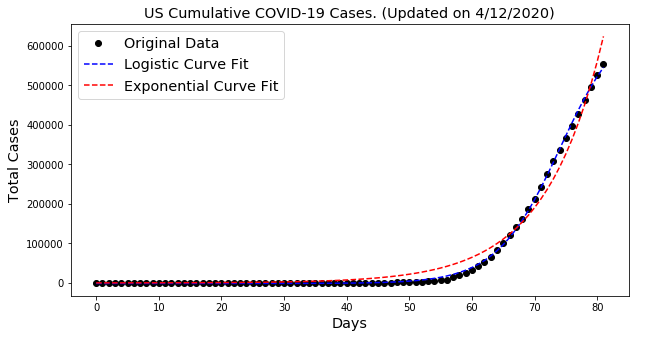
Now we’ve plotted the trends for all nations with more than 1,000 cases as of April 12th. The U.S. still appears to be on an exponential trend, while Italy and Spain seem to be coming out of it. This should make sense, seeing as Italy’s and Spain’s lockdowns were more aggressive than the United States.
These two European nations have also started their lockdowns early, with Italy and Spain beginning their lockdowns on March 9th and 14th, respectively. Lockdowns within the U.S. vary by state; however, the most highly impacted states (California and New York) didn’t institute any lockdowns until the last week of March.
Considering the recent spike in cases in France, our program couldn’t really tell if the trend was exponential or logistic. As a result, both trends were plotted. Today, more than 500 people died in France in a single day, which prompted the government to extend the lockdowns until May 11.
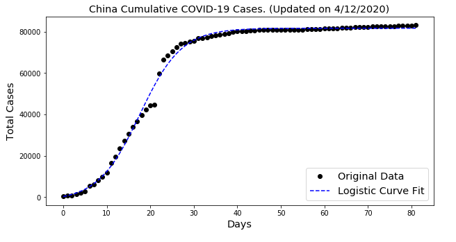
China is also currently experiencing a logistic trend. With the exception for the Guangdong province, the nation has not recorded any new cases in any of its provinces since April 7th. China has not had a consistent and reliable metric of reporting GDP figures. For the same reason, people are more or less skeptical of the integrity of their COVID-19 cases.
Doubling Times for COVID-19 Cases
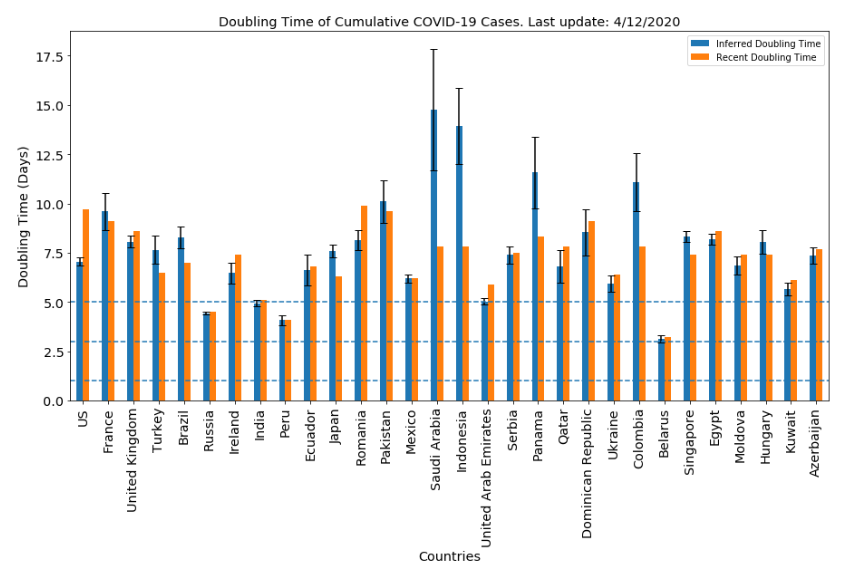
Now we’re going to plot the inferred doubling times and recent doubling times for all countries in one chart. We’ve already calculated this previously. The inferred doubling times are constructed using curve fits. In contrast, the recent doubling times are calculated using the most recent week of data. Obviously, the shorter amount of time it takes for cases to double, the faster overall cases grow, and vice versa.
The inferred doubling time represents the growth encountered during the middle of the growth of the epidemic, which gives us a picture of the overall rate of growth of the virus. After all, epidemiologist won’t really know whether or not we’ve reached the apex of the pandemic until many weeks (or possibly months). In one country that reports 1,000 COVID-19 cases, there could be 5,000 infected people. On the other hand, another country with the same reported figures could have 100,000 infected people.
As mentioned previously, the growth rate in the U.S. is still exponential, and the inferred doubling time is around 7 days. For France, the doubling time is approximately 10 days. Obviously, the high the doubling rate, the more manageable the pandemic is for any particular country. There are very few countries within the error range that we have established.
COVID-19 Trends in the United States
I’ve done many comparisons with the U.S. (mostly because I currently live in the U.S.). We can extend the same analysis to areas within the country. This time, we will be using a different dataset, which only incorporates the U.S.
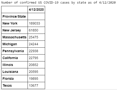
As we can see, New York has the largest number of confirmed cases in the entire nation; followed by New Jersey, Massachusetts, and then Michigan.
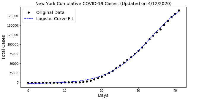
New York’s COVID-19 growth appears to be consistent with a logistic trend, but it might be too early to tell. Other states where the growth seems to be more exponential are Illinois, California, and Washington. Most other states appear to be within the starting phase of a logistic trend, but it might be too early to say, based on the average doubling time (which is 5 days).
Currently, cases double in New York roughly 8 days, while Massachusetts doubles every 5 days. Michigan’s stay-at-home order is set to expire tomorrow if the Governor of that state chooses not to extend the lockdown. However, COVID-19 growth appears to be on the logistic trend, and cases are doubling every 11 days.
Conclusion
There is still more to learn about this virus. We’re still trying to come up with ways to track its behavior, which can only happen with more testing. One thing that can be certain is that this crisis is nowhere near over. As data comes more available, we will be taking steps to analyze it, which will provide more insight into where we need to focus our resources.
GitHub Code
Click here for the full GitHub Code and full explanations.
