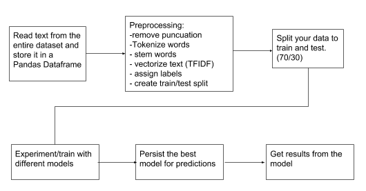
Analyzing News Articles With Python

Never before has America become more polarized than we are today. As such, the news we consume is a function of our polarization. Right-leaning people tend to get their information from Fox News, The Wall Street Journal, National Review, etc. People who lean left tend to get their information from MSNBC, The New York Times, The Huffington Post, etc. There are a handful of neutral publications (Reuters, Politico, Associated Press, etc.). Still, even their alignment falls into question, based on how they report the news.
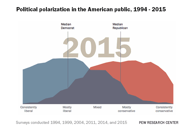
It’s unclear to what extent news plays a role in fueling the partisan divide in our country. There is some evidence to suggest that people, when given accurate information on controversial issues, will choose to disregard this information to fit commonly held beliefs [1]. This perhaps can explain the apparent bias for news outlets. Now, more than ever, people should be allowed to sift through news sources that are free from bias, misinformation, and personal polarization.
All Sides News Aggregator
According to an old Pew Research poll, most Americans would prefer if news media would present the facts without adding their interpretation of the events [2]. Some may argue that objectivity in the news has never occurred, and therefore, impossible, and in some cases, undesirable. Regardless of whether or not our news should be presented from an objective lens, at the very least, journalists should be honest about their affiliation. In comes All Sides.
All Sides is a bipartisan organization that looks at a more balanced approach to news coverage by collecting the top headlines of the day and showcasing the reporting of the news outlet on the left, right, and center. The platform also allows readers the rate the lean of the publication for further analysis [3].
The first mode of attack is figuring out how we can go about extracting these stories for our analysis. We can extract all stories from all publications, but what if we want a more targeted focus? One interesting feature of the All Sides website is that we can look for articles based on the topic.
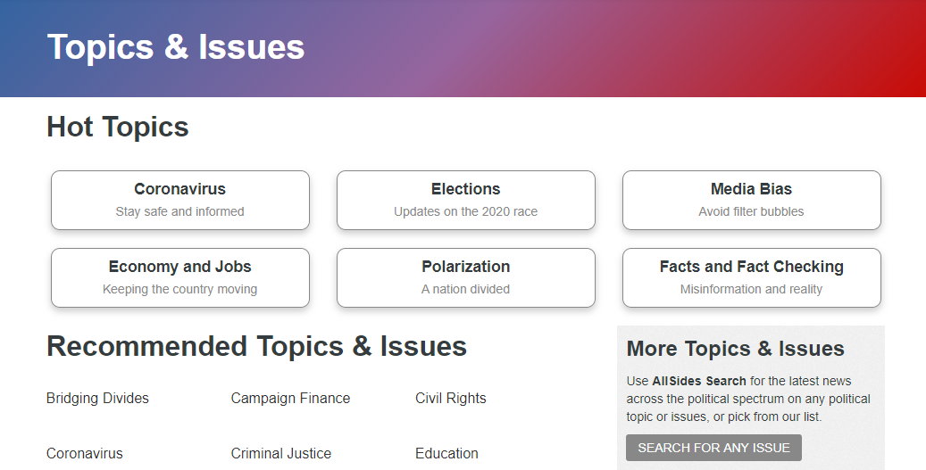
We can get articles from pretty much any topic: Criminal Justice, Education, and the Economy. All Sides even collects the news perspectives on the most important topic in the world right now, the Coronavirus. (Yes, our society is so divided right now, we’ve even managed to politize a deadly virus)
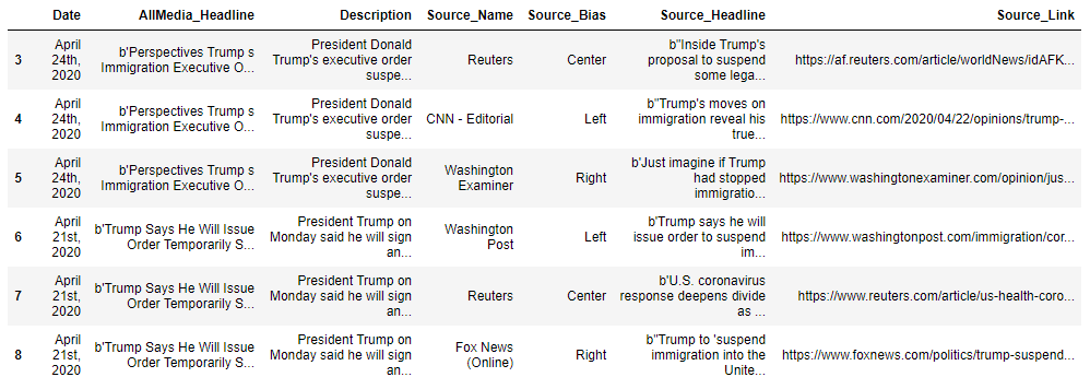
I’m going to use immigration as our topic; I feel it’s pretty easy to understand where both sides (the political left and right) stand on this issue. The first part of the project involves web scraping the information that we are most interested in, such as the headline, date of the story, description, source, the lean/bias of the source, and the link of the story.
The results provide a data frame that we can use as a stepping stone to extract relevant information, such as the body of the article and the authors. Sure, we could have extracted all of that information along with the rest. However, web scraping is very tricky, as no two websites have the same HTML structure and layout. This is especially true for news media websites.
As such, we relied on a third-party source for the extracting news, with the API known as News-Please.
News Please API
News-Please is an open source news crawler that extracts structured information from almost any website. You can use it to follow recursively internal hyperlinks and read RSS feeds to extract most recent and old archived articles [4].
With this API, we only need to provide the root URL of the article to crawl it completely. The New-Please API combines the power of multiple state-of-the-art libraries and tools, such as scrapy, Newspaper, and readability.
Using this API, along with other web crawler techniques, we have randomly extracted 291 articles from multiple sources. The Top 10 articles we extracted are presented in the following data frame.
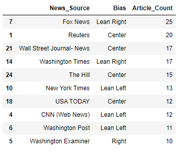
As we can see, Fox News has the largest number of articles in our dataset, with 25 pieces. Reuters is right behind Fox News with 20 articles, followed by the Wall Street Journal (News Section), Washington Times, and The Hill with 20, 17, and 15 articles, respectively.
I can only speak for myself, but from what I see so far, I believe this alignment is correct for the most part. Fox News tends to lean right, while CNN and New York Times lean more left.
I think some people would disagree with the alignment of the Wall Street Journal, as the publisher is owned by News Corp, which is the parent company of Fox News. I believe most people would be inclined to agree, as far as community feedback on All Sides is concerned.
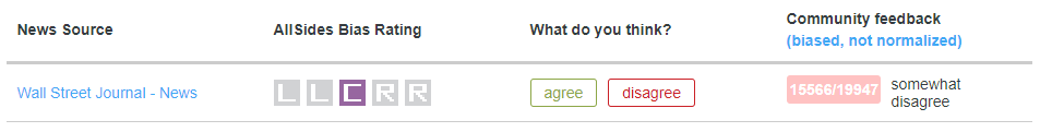
Still, whether or not a news outlet is owned or operated by a particular person has little to do with its overall objectivity and bias. All Sides has conducted an in-depth analysis of major news publications such as The Wall Street Journal and has found that outlet is more aligned to the center than its peers. (Keep in mind, a Center alignment doesn’t mean better!) [5]
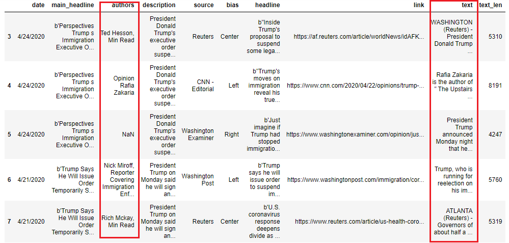
When everything is extracted, we should get the data frame similar to what we presented above. The author and text columns are highlighted to demonstrate that we have obtained this new information. We’ve also included the length of characters for each article (for reasons that will be clear later).
Now that we have all of the information that we need, we can now conduct what is known as a Sentiment Analysis.
Sentiment Analysis
Sentiment Analysis is the process of computationally (at least, programming languages) determining whether a piece of text is positive, negative, or neutral. It’s also known as opinion mining, deriving the opinion or attitude of a writer.
We’ve all received text messages or e-mails, where we are not sure the emotion the sender is trying to convey. Certain words may carry a specific connotation that is not clear to many different types of people. Sentiment Analysis can be considered an unbias way of analyzing text.
Machine Learning practitioners utilize sentiment analysis in several different fields.
-
Politics: I suppose this project involves politics to some degree, but we can use sentiment analysis to keep track of the consistency between specific statements and actions at the government level.
-
Finance: As you are already aware, I am in the Finance industry. My personal experience using Sentiment Analysis in Finance consists of analyzing news articles related to specific publicly traded companies and predicting stock movements based on how the news impacted the underlying stock. This is just one example, but there are dozens of different examples of how sentiment analysis is used in Finance.
-
Shopping (Online, Restaurants): Have you ever tried to purchase a product on Amazon? (You’re human; of course, you have.) How do you know if you can trust the reviews? What about the reviews on a Yelp listing? Sentiment Analysis can help you determine whether or not a review is fake or made by a real person.
In our case, we are using it to examine the bias of news articles.
Natural Language Processing using Google API
Natural Language Processing (NLP) is a field of Artificial Intelligence that gives the machines the ability to read, understand, and derive meaning from human languages. Python already provides a well-known NLP module for this task, namely the Natural Language Toolkit (NLTK). However, there is a lot that goes into preparing the data to feed through a Naive Bayes or Support Vector Classifier.
As we can see, the process for using the nltk module is a painstaking process, as you can see. If we compare it with Google’s Natural Language API, the process looks a little more like this:
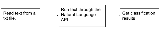
As we can see, it’s much more manageable. No need to look for specific stop words, tokenize the text, or test/train our dataset to fit the module.
To use Google Natural Language API, you need to set up a Cloud Library account, enable the Natural Language API, and download the project file you are using for the API. The tutorial for this process can be [6].
The next process involves using Google’s NLP API to analyze the articles we’ve extracted from Part Two. We are going to create a loop that measures the Sentiment and Magnitude of each text and assign it to two new columns.
Sentiment and Magnitude
So what is the concept behind Sentiment and Magnitude, and how does it help us in our analysis?
Sentiment attempts to determine the overall attitude (positive or negative) expressed within the text. The of a text will range between -1.0 (negative) and 1.0 (positive). Of course, it goes without saying that a score of 0.0 is considered neutral.
Magnitude indicates the overall strength of the emotion (either positive or negative) within the given text. We’re not sure how high this metric can go; however, the minimum us always 0. Unlike sentiment, magnitude is not normalized; each expression of emotion within the text (positive and negative) contributes to the text magnitude. So longer text may have greater magnitudes.
It’s important to note that the Natural Language indicates differences between positive and negative emotion in a document, but does not identify specific positive and negative emotions. For example, “angry” and “sad” are both considered negative emotions. However, when the Natural Language analyzes text that is considered “angry,” or text that is considered “sad,” the response only indicates that the sentiment in the text is negative, not “sad” or “angry.”
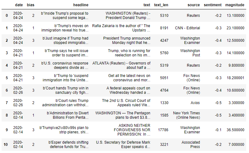
For example, our DataFrame has returned the results of our Sentiment Analysis for the articles published from April 14th - 14th. As we can see, the majority of the articles are negative. It unclear whether or not this is any relation to the subject matter or just the nature of the industry, in general [7].
The articles with a sentiment score closer to zero are published by The Associated Press, Washington Examiner, and Reuters. Looking at the magnitude scores, we can see the Washington Examiner article has a magnitude of 36; however, we have to remember that the value is proportional to the length of the text. Seeing that the article published by the Washington Examiner has 17,000+ characters, this makes sense.
On the other hand, the Washington Examiner is not part of the mainstream media and primarily publishes opinion and commentary, which explains the degree in magnitude. If anything, the articles published by the Washington Examiner, Associated Press and Reuters can be considered mixed (a neutral sentiment with a strong degree of emotion)
The articles published by Axios and New York Times shows a sentiment score of -0.5 and a magnitude of 3.3 and 3.4, respectively, which shows a clear negative sentiment. (Most people would not find this surprising coming from NYT) However, Fox News (Online) has two similar stories that convey a slightly less negative sentiment. Because the sentiment is less than -0.5 and the magnitude is relatively strong, we would rate the sentiment for both Fox News articles mixed, rather than clearly positive or negative.
“Clearly Positive” or “clearly” negative sentiment varies for different cases and outlets; however, because the vast majority of news articles are negative (or at the very least, has a sentiment score of less than 0), we require a meaningful threshold to determine if an article was truly negative.
Of course, this is all dependent upon the dataset, as well as the types of articles we extract. However (for now), we choose to use this threshold for news involving political issues.
Visualizations and Statistical Analysis
Box and Whiskers Plot
Although, this information is a little harder to convey on a histogram. It can be seen more clearly on a box and whiskers plot.
The distribution (as well as the skew) are more apparent when presented in the form of a box and whiskers plot. I’ve also presented the data to show where the outliers are. In order to determine which observations in distribution would be considered an outlier, we need to find something that is called the Interquartile Range.
The interquartile range or (IQR) measures where the median of the dataset should be. While the range is the measure of the highest and lowest values (visible where the “whiskers” are found), the interquartile range is the range where the bulk of the values lie. It’s usually preferred as a measurement of spread when reporting values such as SAT scores.
The IQR can be found by finding the difference between Q3 and Q1:
$$IQR=Q3-Q1$$
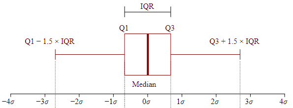
Once we have found the IQR for each dataset, we now need to calculate the lower and upper bounds. The lower bounds can be found by taking Q1 and subtracting by 1.5 times the IQR. The upper bound can be found using the same way, except we are using addition instead of subtraction. To bring this explanation in perspective, I’m going to use a few statistics for right-leaning sources.
Each diamond plotted above the whisker is considered an outlier, and they’re lots of them in our right-leaning dataset. However, these articles primarily consist of opinion pieces from the Washington Times, Washington Examiner, The Christian Perspective, Reason, and the National Post. (The largest magnitude in our dataset for right-leaning sources)
Despite all the outliers, the distribution of the right-leaning dataset is still similar to that of the “politically-neutral” sources. However, there is a major skew in the distribution for left-leaning sources. Although the variation is greater (IQR of 17.6!), the whisker on the far end is much longer than the whisker for right/center-leaning sources.
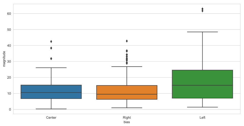
This data suggests that writers for left-leaning outlets are more likely to implement their personal feelings and emotions into the articles they publish. I suppose we can expect this from outlets such as Vox and perhaps The Guardian, but the Washington Post and the Los Angeles Times are considered more “news-oriented” outlets.
Perhaps I made a mistake when scraping news and didn’t realize I was collecting pieces from the editorial section. OR maybe the mistake was made on their part when mislabeling an article “news” when it should have been labeled “opinion.” Who can say?
Conclusion
There is a lot more that can be done here; we’re just scratching the surface. Using data science and machine learning in the news/political field means that we can conduct a range of meaningful analysis. We can expand this work into other research, such as News Classification, Filtering Bubbles/Echo Analysis, Topic Modeling, Entity Analysis (probably the next project), news bias prediction, and so much more.
In the age of hyper-partisan tensions, this tribal news-cycle can only get worse. We need more people who are willing to analyze the direction our media is taking so viewers can make informed decisions about how to consume their news.
As long as I have more free time (currently working from home), I guess that person might as well be me.
Github
Click here for the full GitHub and full explainations.
Sources
[1] Oxford Academic | Investigating the Generation and Spread of Numerical Misinformation
[2] Pew Research | Majority of U.S. adults think news media should not add interpretation to the facts
[3] All Sides | Unbiased news doesn’t exist, but it provides news in a balanced way
[4] GitHub | Felix Hamborg news-please Repository
[5] All Sides | Wall Street Journal - News media bias rating is Center
[6] Google | Natural Language Processing Client Libraries
[7] Psychology Today | If It Bleeds, It Leads: Understanding Fear-Based Media
Andre Sealy
Quant Research / Data Scientist / Writer
My research interests involves Quantitative Finance, Mathematics, Data Science and Machine Learning.