Modeling GDP per Capita and Life Expectancy
Historically, wealthy individuals tend to live longer than poorer individuals, holding other factors constant. They can afford to eat healthier foods from healthier food outlets (such as Whole Foods); they can afford better health care, et cetera.
For this reason, it should be obvious that as countries get wealthier that they should be able to afford better health care systems, also that life expectancy should rise. It should also stand to reason htat people living longer, will work longer and that being healthier means fewer people as a propotion drop out of the labor force due to illness.
However, these relationships probably are not linearly. They’re likely to be diminishing returns to one from the other. At least, that is my prior belief.
My first hypothesis is that returns to life expectancy at birth from increases in Gross Domesti Product (GDP) per capita are deminishing. This is because there is probably an upper limit on the length of human life and that approaching it is more difficult the closer humans reach.
Also, it is easy to concieve nations consuming more unhealthy luxury items as they become richer. Therefore, I expect the coefficient on GDP per capita to be positive and the coefficient of GDP per capital squared to be negative in the regression of life expectancy on the GDP per capita variables.
My second hypothesis is that returns to GDP per capita from increases in life expectacy are diminishing. Therefore, I expect the coefficient of life expectancy to be positive and coefficient of life expectancy squared to be negative in the regression of GDP per capita on life expectancy and life expectancy squared.
To test these hypothesses, I repeatedly estimate those models over crosssections in my sample period using Ordinary Least Squared (OLS) regression. Finally, I plotted the model coefficients over time to see if the relationships have changed.
There are already tons of literature on this question, but I chose not to research it because it did not want bias to approach this problem. Significance in this document is at the alpha = 0.05 level.
Data and Sample Period Selection
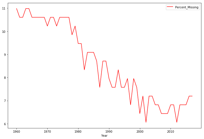
I used data sets from the World Bank to perform this analysis. I selected my sample period by examining the period of the missing values and choosing long time periods with as few missing observations as possible. This seemed to be the period from 1990 to 2017. Removing observations that weren’t real countries (mainly regional and world-wide averages) and performing an inner join between two variables on the sample period left about three quarters of our countries in our data set, of 163 observations.
Plotting our Variables of Interest
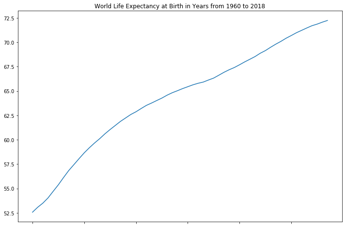
Below is how the life expectancy at birth for the world has changed over the years. It has increased steadily over the years, which is good for all of us.
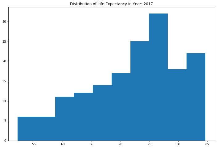
This histogram is representative of the distribution of life expectancy in 2017. The mass of the distribution is on the right with a long left tail. This is good because there are more countries living longer than countries with lower life expectancy levels.
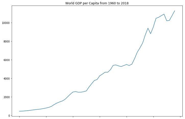
World GDP per capita has grown exponentially over time, but there are some sharp drops from severe negative shocks. This is still a good thing for humanity because it means fewer people as a percentage of the total population are in poverty compared to years prior. Again, this doesn’t tell us about the distribution of GDP per capita in a cross section.
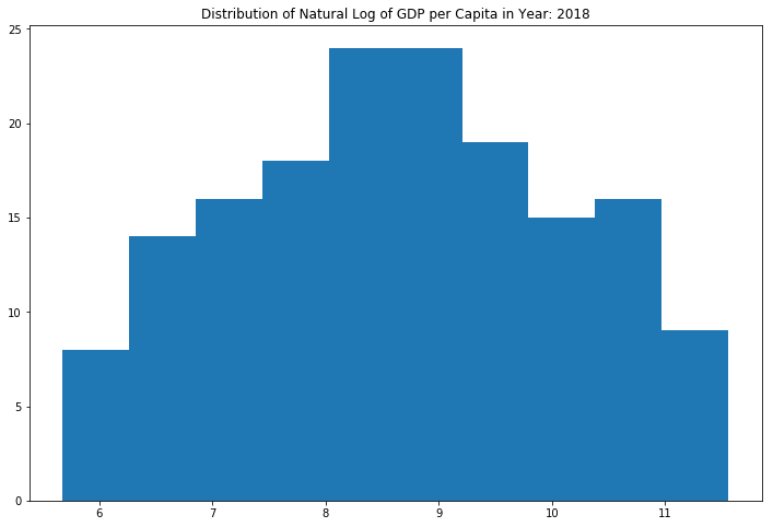
The distribution of GDP per capita is very concentrated in the 0 to 10,000ish range, but has a long right tail out to over 100,000 GDP per capita. This resembles a log-normal shape. I performed a natural logarithmic transformation for modeling purposes.
Modeling the Relationships
The Jupyter Notebook I’ve created contains all the regression outputs for every year; however, I’ll just summarize them and provide the plots of the coefficients.
Regressing Life Expectancy on GDP per capita
The residuals of this model seem mildly skewed left from 1990 to 2003, and a strong left skew after that with kurtosis in excess of the normal distribution. We won’t really get into what kurtosis is in this blog post, but you should know that in probability and statistics, kurtosis measures the “tailedness” of a probability distribution.
The kurtosis of a normal distribution is 3, so any value greater than that will exhibit skewness either to the left or right. The output of the Breusch-Pagan heteroskedasticity test provides strong evidence of heteroskedasticity in the residuals, but I used heteroskedasticity robust standard errors to be sure the model didn’t underestimate the standard errors of the coefficients.
So the residuals are not normally or identically distributed. The Durbin-Watson statistic remains close to 2, so it doesn’t appear to be auto-correlation in our residuals. The R-squared, $r^{2}$, of these regressions are absurdly high, ranging from 0.992 to 0.997; meaning, between 99.2% to 99.7% of the variation in life expectancy is explained by this model specification.
Regressing GDP per capita on Life Expectancy
The residuals of this model seem approximately symmetric throughout the entire period, as the skewness stays between -0.5 and 0.5. The kurtosis remains fairly close to that of the normal distribution but does exceed it in some periods. The Jarque-Bera test for normality fails to reject the null hypothesis of normality from 1993 to 2007, and from 2015 to 2017.
Perhaps the break in the string of models with normal residuals is related to the 2007 financial crisis and recovery. The output of the Breusch-Pagan heteroskedasticity test give strong evidence of heteroskedasticity in the residuals, but I used heteroskedasticity robust standard errors to be sure the model didn’t underestimate the standard errors of the efficients.
So our residuals are occasionally not normally or identically distributed in our sample period. The Durbin-Watson statistic remains close to 2, so at least there doesn’t appear to be auto-correlation in our residuals. The $r^{2}$ of these models range from 0.985 to 0.993, meaning between 98.5% to 99.3% of the variation in the natural log of GDP per capita is explained by this model specification.
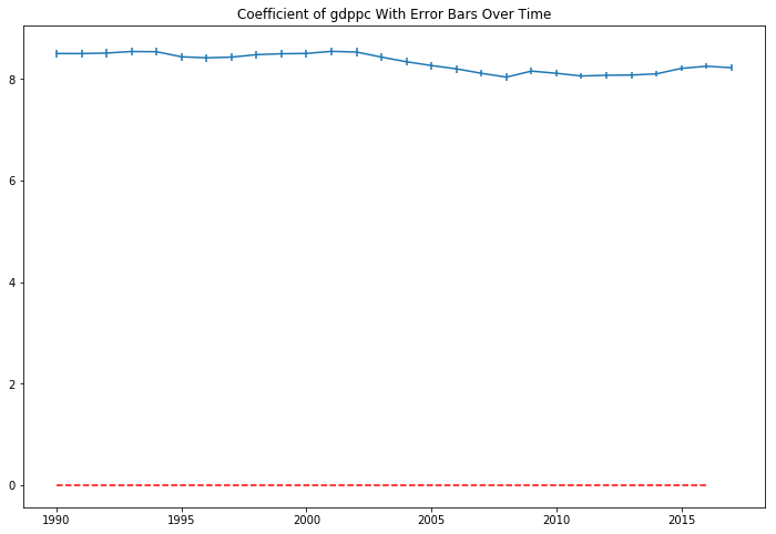
The coefficient in the model are sigificant in each year, but are both positive, disproving my second hypothesis. There are positive, and increasing returns to the ln(GDP per capita) from increases in life expectancy in our sample period. Plotting the coefficient with their 95% confidence interval bars over the sample period show they appear somewhat volatile over time.
There doesn’t seem to be a straight line that intersects all of the confidence intervals. In a 27 sample period, we would expect a 95% confidence interval to not contain the true parameter 0.05 x 27 = 1.35 times, but it seems 10 periods might barely miss a horizontal line that tries to hit as many intervals as possible. Still, this isn’t conclusive evidence that the relationship between GDP per capita and life expectancy has changed over the 27 year period. Just a strong clue to dig deeper.
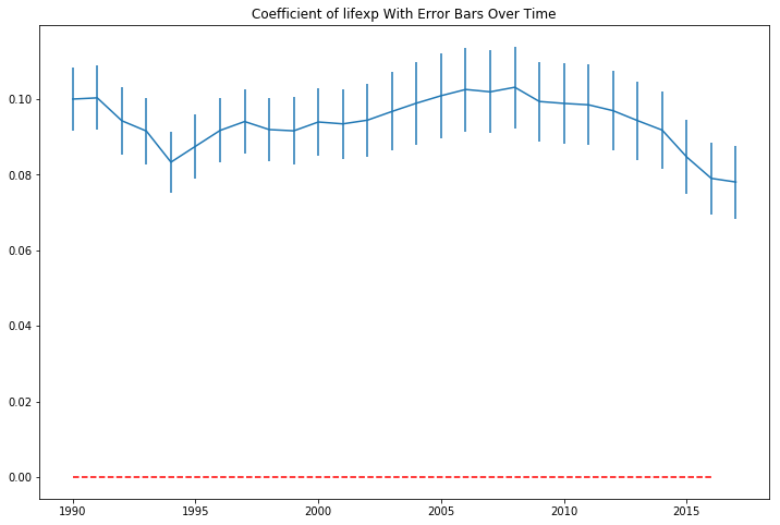
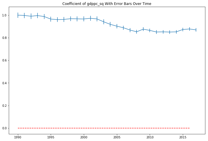
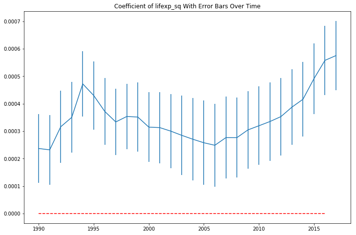
The plot of the life expectancy squared coefficients looks like it is mirroring the movement of the non-squared term coefficients at a different scale.
Interpreting the Regressions
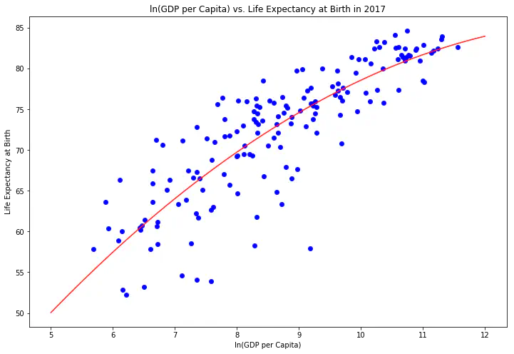
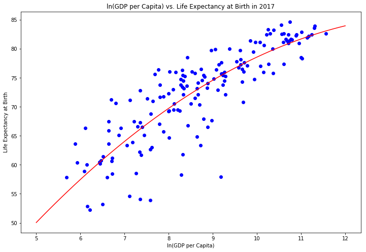
Looking at the scatter plots below for the most recent data (2017), along with the regression lines, show that the variables have a relationship with one another. Also, there is more variability among the lower and middle-income countries than the high-income countries. Explaining the differences between low and middle-income countries with higher levels of life expectancy versus lower life expectancy levels seems like an interesting avenue of research that could provide important insights into interventions that could help improve people’s lives.
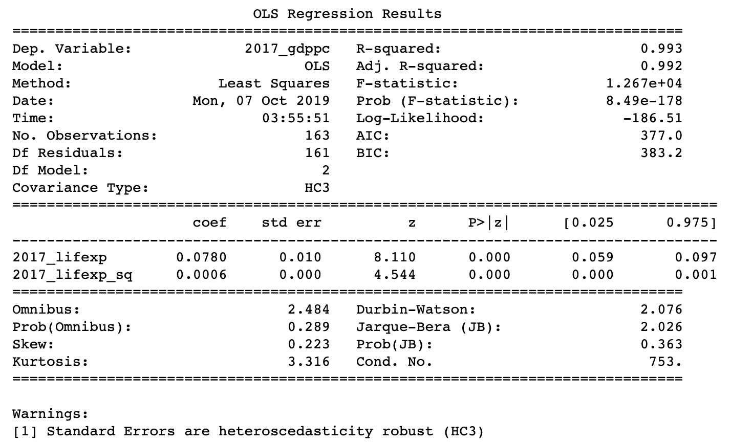
The way to interpret the coefficients in the 2017 model regressing life expectancy on ln(GDP per capita) and ln(GDP per capita) squared is a 1% increase in GDP per capita leads to a year increase in life expectancy.
$$\hat{y}=\frac{12.1586-20.4300ln(GDP\ per\ capita)}{100}$$
This combines the level-log coefficient in interpretation with the interpretation of coefficients as marginal effects, aka partial derivatives, of the dependent variable with respect to the independent variable in question.
Generically, an increase 1% in GDP per capita leads to the following increase in life expectancy:
$$\hat{y}=\frac{\beta_{1}+2*\beta_{2} * ln(GDP\ per\ capita)}{100}$$
where $\beta_{1}$ is the coefficient of the non-squared term and $\beta_{2}$ is the coefficient of the squared term. The numerator is the partial dervivative of life expectancy with respect to ln(GDP per capita). All regression coefficients are partial derivatives. I just want to emphasize that with higher order terms, you cannot correctly interrep the coefficient of $x$ seperately from $x^{2}$, where n is not 1 or 0.
The following are the modeling results.
Implications
My hypothesis that higher income countries live longer, but with decreasing returns to life expectancy from additional increases in per capita income is supported by the evidence. This isn’t very interesting.
However, I found that increasing returns to ln(GDP per capita) from increases in life expectancy. Although, causation or a causal channel has not been established, it seems plausible that healthy workers stay in the work force longer without dropping out due to illness.
This in turn results in more GDP per capita growth. Perhaps there are alternate or additional pathways for the relationship as well. The results of this exploration strongly suggest that investing in better health care systems will have positive effects on the economy.
Andre Sealy
Quant Research / Data Scientist / Writer
My research interests involves Quantitative Finance, Mathematics, Data Science and Machine Learning.